Serving customers meaningful insights and control about their energy consumption anytime, anywhere.
Serving customers meaningful insights and control about their energy consumption anytime, anywhere.
Client
Stadtwerke Düsseldorf
Platform
iOS, Android
Year
2018
Involvement
User Experience, User Interface, Interaction, Prototyping, Iconography
Summary
I was asked by Stadtwerke Düsseldorf, an energy supply company, to help them design the ServiceApp. The ServiceApp brings an overview and transparency around the customer's energy contracts and builds upon their SelfService web portal. Currently, more than 100k active customers are using this service. The app allows you to track your energy usage and can quickly identify potential energy savings on the go. It also lets you scan your meter readings with the smartphone's camera for submitting these automatically. This process is more accurate than any estimate and ensures that you can better adjust to any additional payments for electricity or ancillary costs.
Problem Statement
Serve customers meaningful insights and control about their energy consumption through their smartphones by establishing a customer-centric business model that focuses not on the product itself, but the customer relationship.
Project Goals
Build an app experience with the intention of two primary purposes:
Get an insight into all your energy consumption and costs at a glance.
Get an insight into all your energy consumption and costs at a glance.
Submit accurate meter readings instantly, without any friction.
UX Design Process
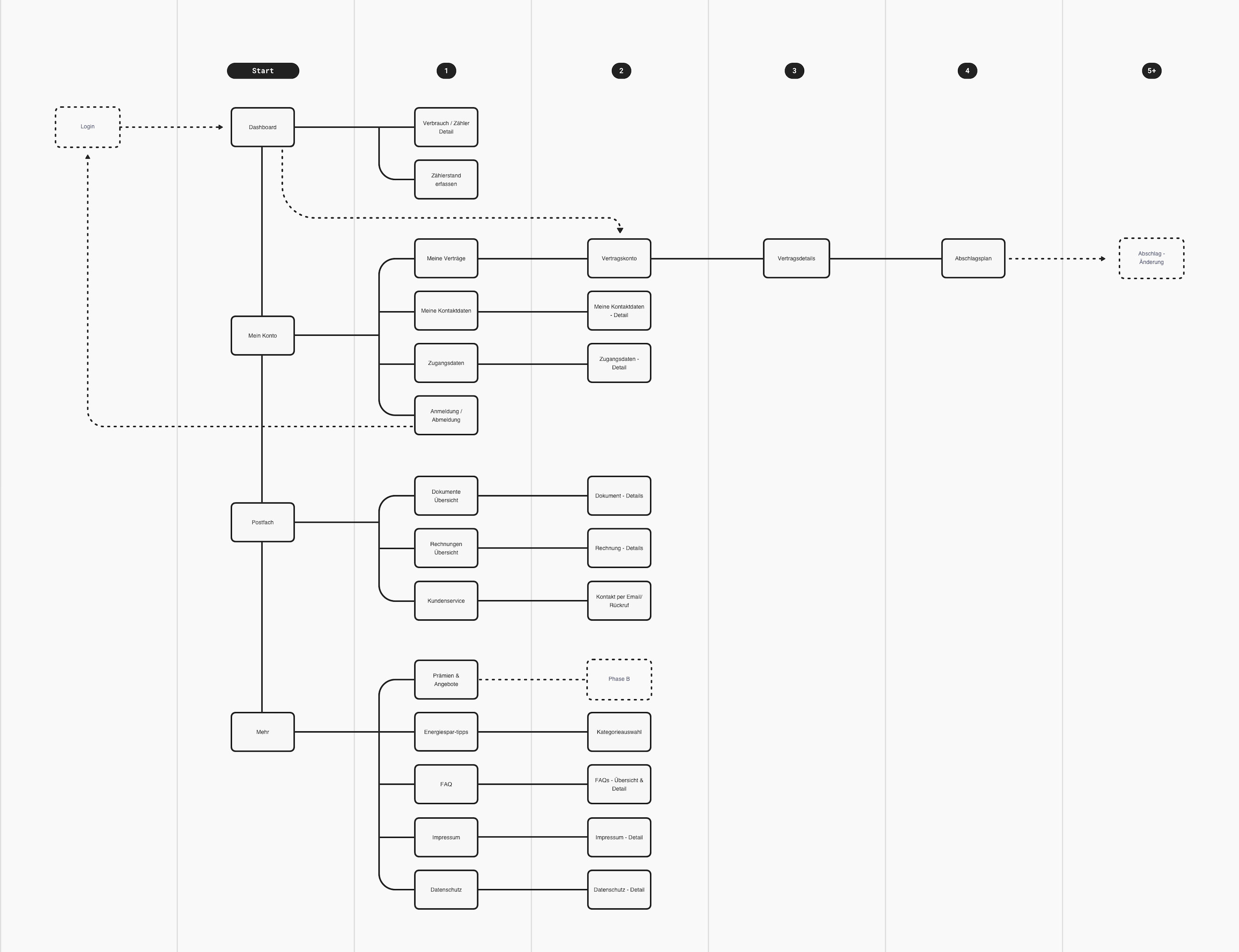
My work mainly focused on designing the user experience and user interface for the iOS and Android app. Furthermore, it included the creation of an information architecture map, interaction design, and prototyping.
As usual, I start with designing in words first by chunking the potentially complex and even simple activities into smaller tasks to shape an experience-first perspective for the user. Mapping out the interaction flows to get clarity about what you are are building, and having a robust communication tool for the whole team is the primary goal of this process.
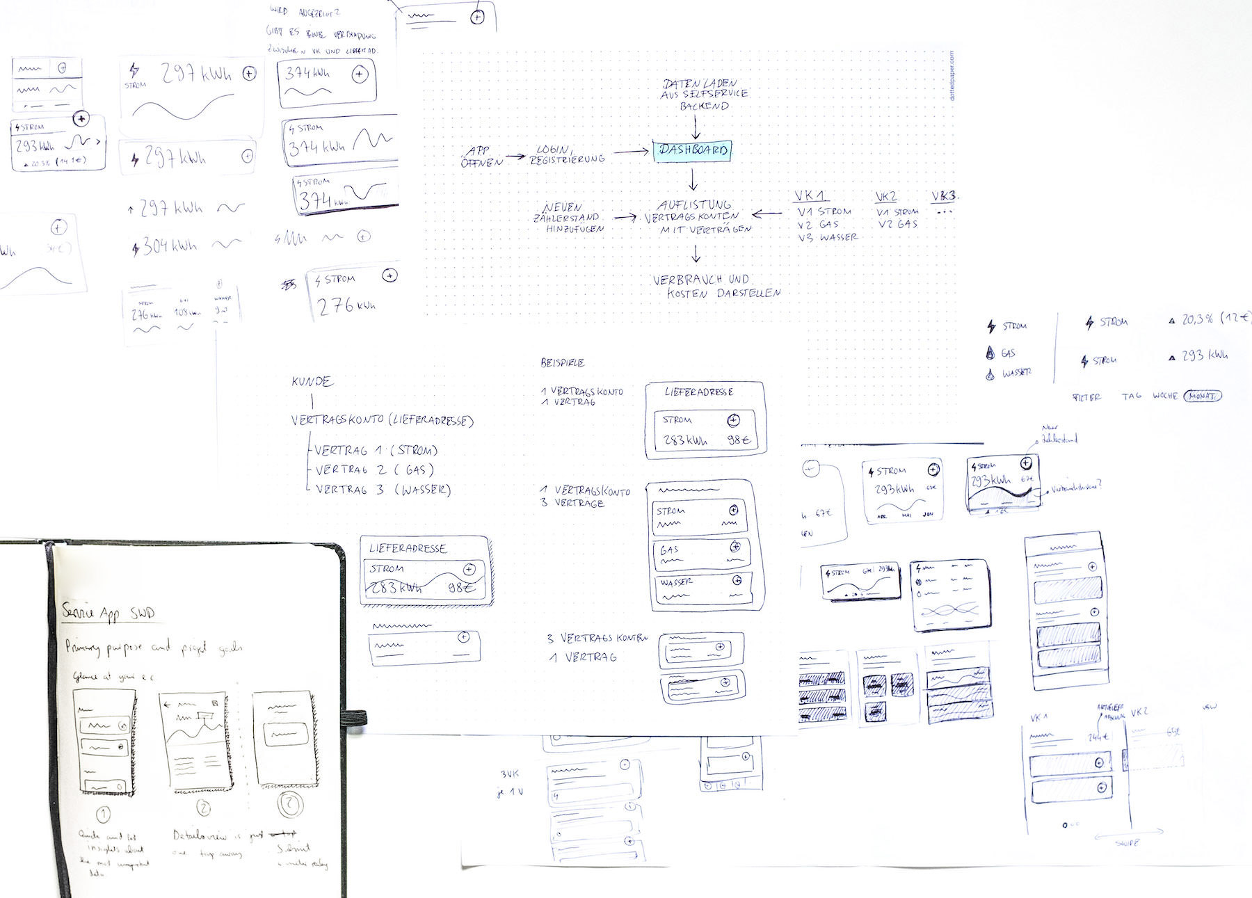
A big challenge was to accommodate multiple accounts of a user, each containing sub-accounts with different energy supply contracts into an overview. The outcome is a dashboard visualization with all the relevant data combined in one view. This way, users get an insight into their overall energy consumption of all accounts they have at a glance, without them having to navigate into details first.
We had to consider the following use cases into our design decisions:
- Customers' having only one supply address containing different energy supply contracts, e.g., private accounts.
- Customers' having multiple supply addresses with mixed contracts linked to their account, e.g., business accounts.
The advantage of designing in words first and sketching the flows on paper helped me to uncover the essential information we needed for a user-centric design. Only after that, I continued with the next steps of creating the actual wireframes and screen designs of the app. As a bonus in this early project stage, I managed to reduce the needed interaction for the user to accomplish their tasks to a minimum.
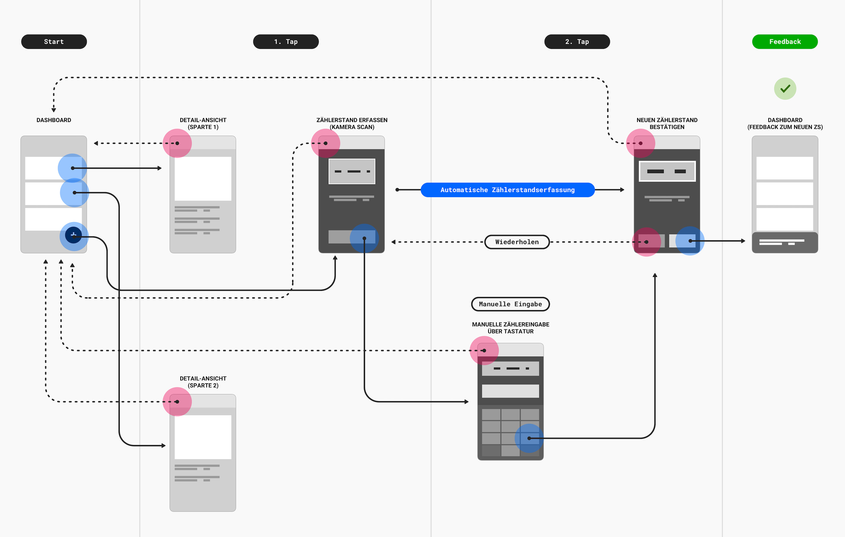
In fact, the two primary purposes of the app, tracking energy, and submitting new meter readings, can be done with only two taps after opening the app.
Connecting the dots
Connecting the dots
Before jumping into the colored visuals, we made sure to have a stable user-flow map. That’s why we created a clickable UX flow demo that connected every interaction point. We put the UX demo on the web, so even people outside the project could access it with their smartphones for guerrilla testing and provide feedback quickly. Navigating through the demo enabled us to spot usability issues easier. Intentionally, we set the UX wireframes in greyscale to focus on the displayed information and to not get distracted by color.
Prototyping
I love the power of prototyping when designing tangible solutions. They let you think deeply about how things are interconnected with each other and help you even avoid costly mistakes. Prototypes minimize the design discussions around how things behave when seeing it live and shape the perception of the overall design, thus bringing about shared understanding to everyone in the team. More importantly, it's an essential tool for user testing purposes of determining and understanding exactly how users will interact with your product. I enjoyed the use of prototypes in this project, which enabled us to come up with useful interaction patterns that we might have missed otherwise. We used click-dummy prototypes in user testings to get usability insights from customers.
Prototyping helped me reinforce my design decisions when communicating with stakeholders and developers, especially when presenting micro-interactions. Principle and Framer got used as prototyping tools.
UI Design
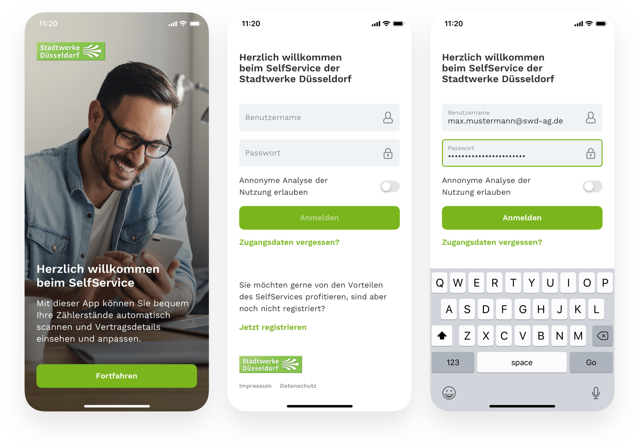
Login
If you are already a user of the SelfService of Stadtwerke Düsseldorf, log in to the ServiceApp with your user data. Otherwise, if you are not registered and want to benefit from the advantages of the SelfService, you can sign up through the app.
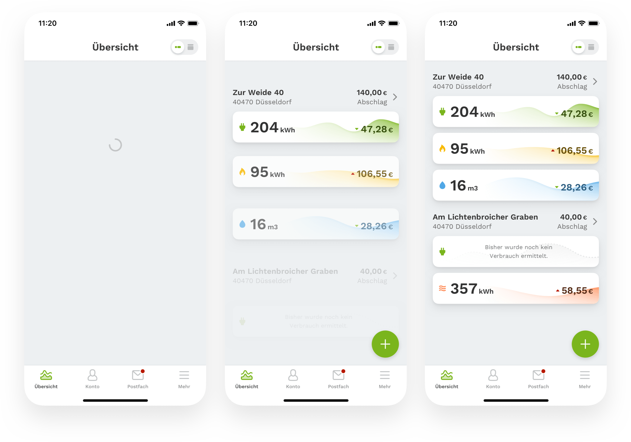
Dashboard
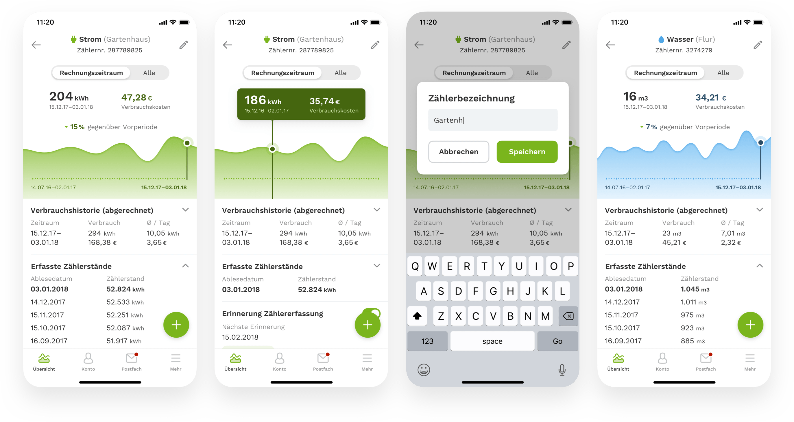
The center of the app is the dashboard interface. It’s the first page you see after the login and provides you with a list of all the energy supply contracts at a glance.
Data-driven design
I worked in close collaboration with the developers from early on to accommodate all different types of users to make use of a data-driven design approach in the UI. So that's why we set up ten test accounts, each having different energy supply stats to represent the different types of users to build a tailored design.
The project environment setup included:
- Test accounts in the SelfService portal for having real data.
- A demo app to log in to the test accounts.
- The UI design which I shared with the developers and updated using a tool called Zeplin.
Unlike private customers, the consumed energy stats for business customers can get pretty high, resulting in visually large numbers. Using real data helped us realize these differences to incorporate these in the UI.
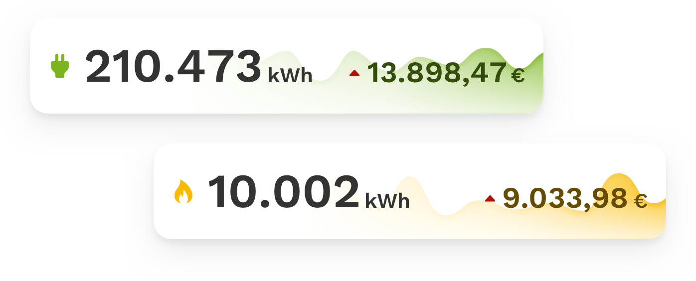
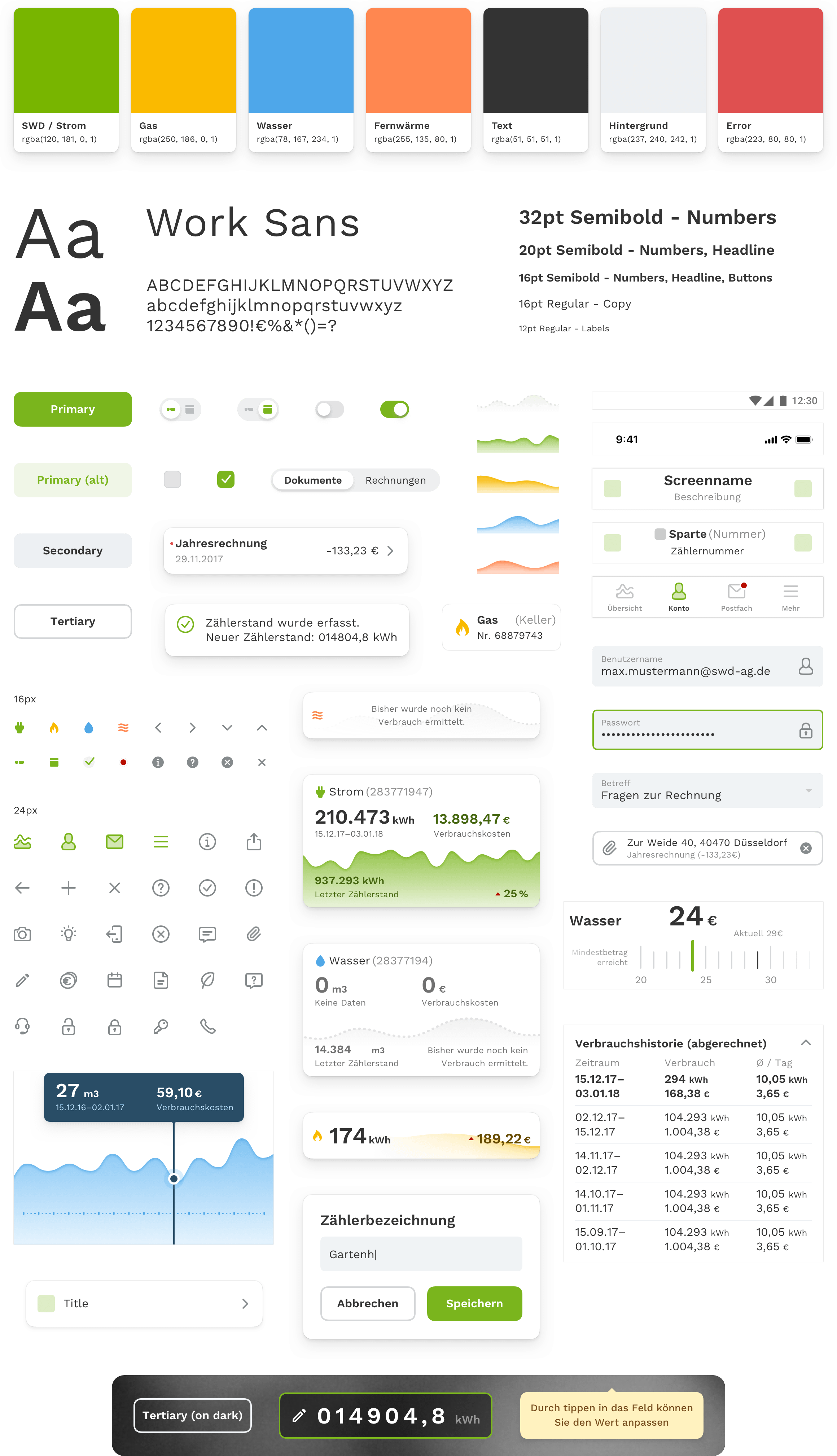
Like any other part of the app's design, the dashboard is built together out of reusable components. These component objects are nested into each other to show what is part of what. The dashboards interface starts with an actionbar element, including a custom toggle for switching between two views, more on this later. The content itself shows the supply address component containing a headline and the current installment payment. The more exciting part for the user is what follows with the energy type component. Every energy type element features an icon, the consumed energy for the month, a graph visualization of the measured value periods, and the costs with an up/down usage indication comparing to the previous period. While designing, we made sure that the design supports as many devices as possible, including the small ones like the iPhone SE and Android phones with a 360px screen.
At Stadtwerke Düsseldorf, a customer can conclude a contract for four types of energy. These are electricity, gas, water, and district heating. For visual clarity, we separated these four types with a combination of an icon plus a color code. Besides the design of the dashboard, the rest of the apps UI components is in unsaturated colors for further distinction between energy supply types and other information. The only exception is the color green which is for electricity and actionable elements of the UI. The companies brand color is green, and the most concluded energy supply type is electricity, so we chose the same green color for this.
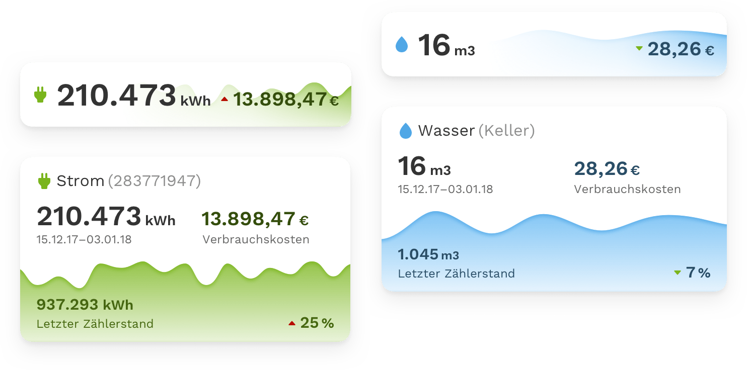
The energy supply type component in its original card form displays enough information for a glance. An energy measurement entries additional values, of which the meter reading is one of the most important. We focused on what is most helpful for the customer, in this case, the consumption and costs, and put the meter reading second. We didn't want to disrupt the customers' experience by cramming too much information into the initial view. By hiding complexity with subtle design decisions, we managed to elevate the critical information to help people understand what they see in front of them and reduce cognitive load.
See more with a simple switch
We placed a toggle in the dashboards UI to give customers an option for revealing additional information. The toggle enlarges or shrinks the energy type card elegantly between what we call a compact and an expanded view. The expanded view shows the meter reading and a percentage indication on the graph as an extension to the costs. As a side note, the meter reading info in the expanded state helps you to compare that against your utility meter reader before submitting new readings.
Automatic meter scanning instead of manual entry
The user has the control of adding new meter readings with an OCR scan through the smartphone's camera by tapping the green add button. When tapped, a list of your energy types appear, each having a unique utility meter id for identification. After the selection, the smartphone's camera UI surfaces with a custom overlay-frame advising you to point the camera against the utility meter. If the meter display is within the camera viewfinder, it instantly scans and verifies the reading with a data quality check. A third-party service called Anyline provides for this scanning of the meter reading. It's much like the experience of scanning a QR code with the smartphone's camera. Manual entry is an option, in case you need to type in the digits manually. The last step after the scan is a decision of whether you want to save the scanned value for submission or edit it.
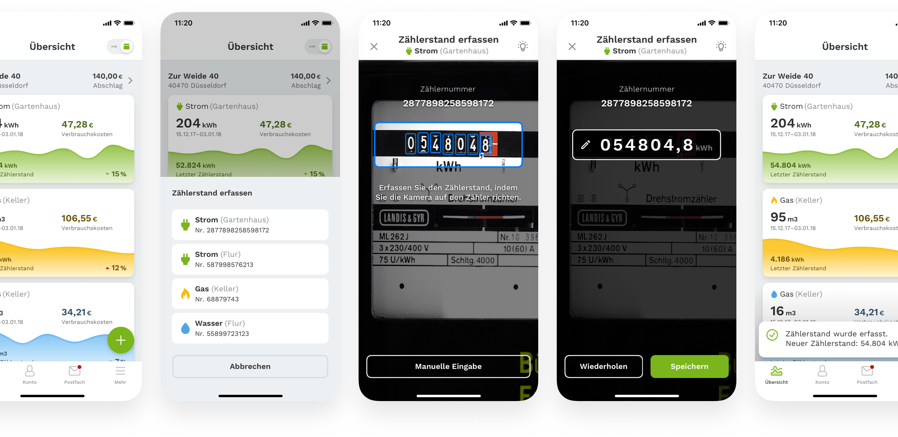
Mobile meter scanning eliminates the errors of manual data entry and reduces the time needed to get readings by 90%. This improves efficiency, data quality, and customer experience.
Delightful details
We backed a playful shortcut feature into the dashboards add button to enrich the user experience further. Instead of tapping the add button and selecting the energy type from a list, the user has the option to grab and drag the button directly on the energy type card for instant selection. We inform the user about this option with an action-driven tooltip in the dashboard.
Energy Consumption Details
Tapping on one of the energy type cards brings you into the details screen. Here you see the consumption history, which includes previous meter readings, measurements, costs, and you can set an alarm for letting you know with a notification when to submit the next meter reading. There is a small interaction detail in the graph. By scrubbing over it, you get an instant preview of the previous measurements.
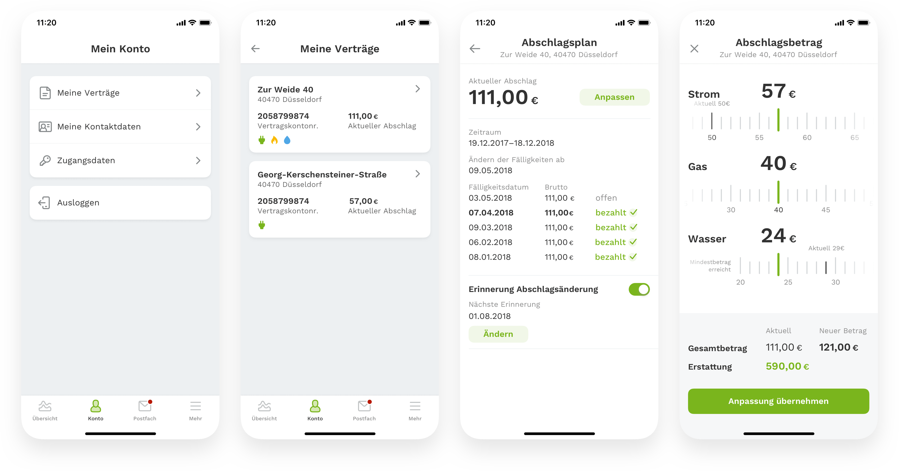
Account Management
If customers notice that their current consumption does not correspond to the agreed advance payment, they can easily reduce or increase it here in the account details - quickly and flexibly. The account tab is where customers can view all contract details, including an overview of the payment history.
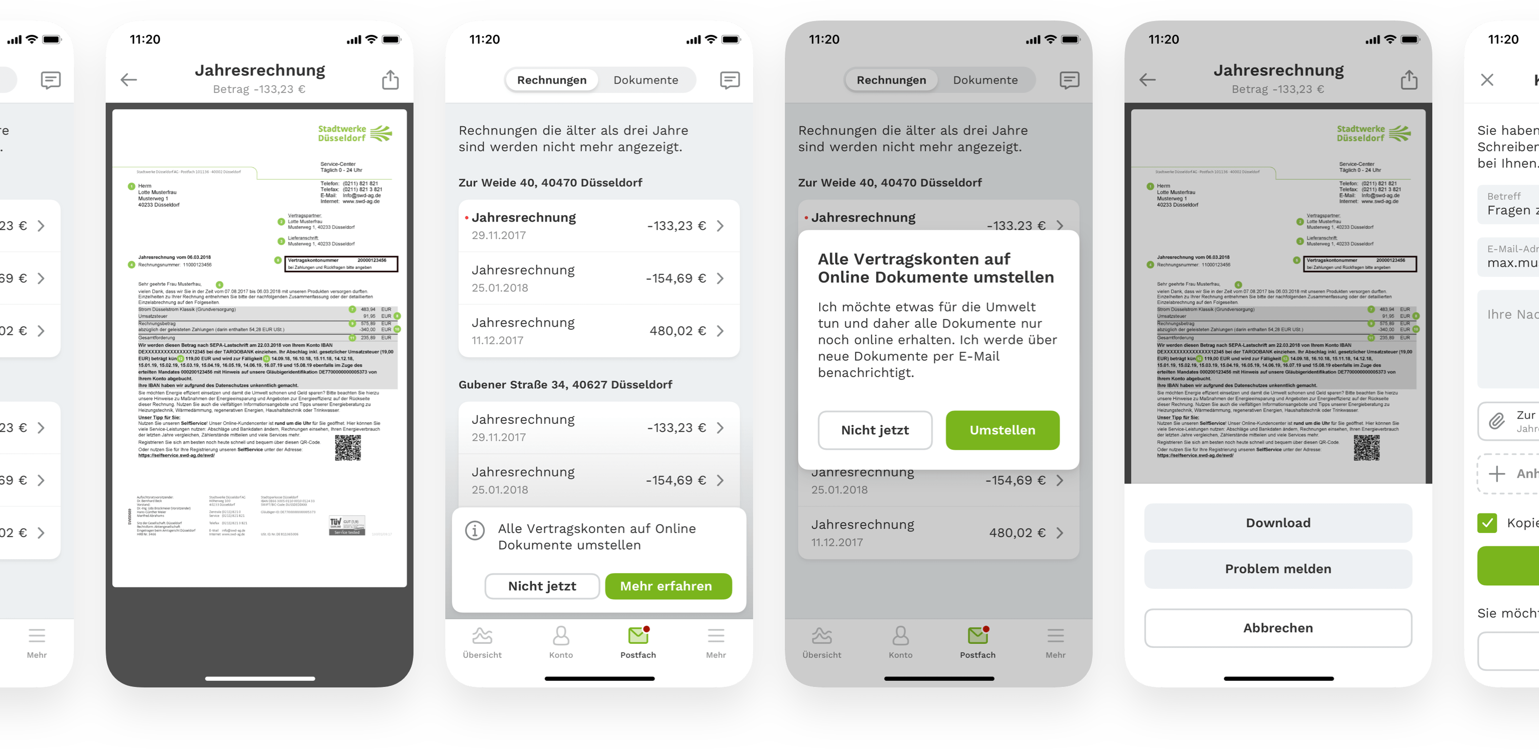
Inbox & Customer Care
The inbox is the customer's place for finding invoices and documents when in correspondence with Stadtwerke Düsseldorf. One red badge on top of the inbox icon indicates newly received documents. A chat icon in the top right is there to contact the supply company for support. Customers can send requests through a contact form or directly call the company. When noticing a discrepancy with an invoice, customers also can use the shortcut to put that invoice as an attachment directly into the request.
More
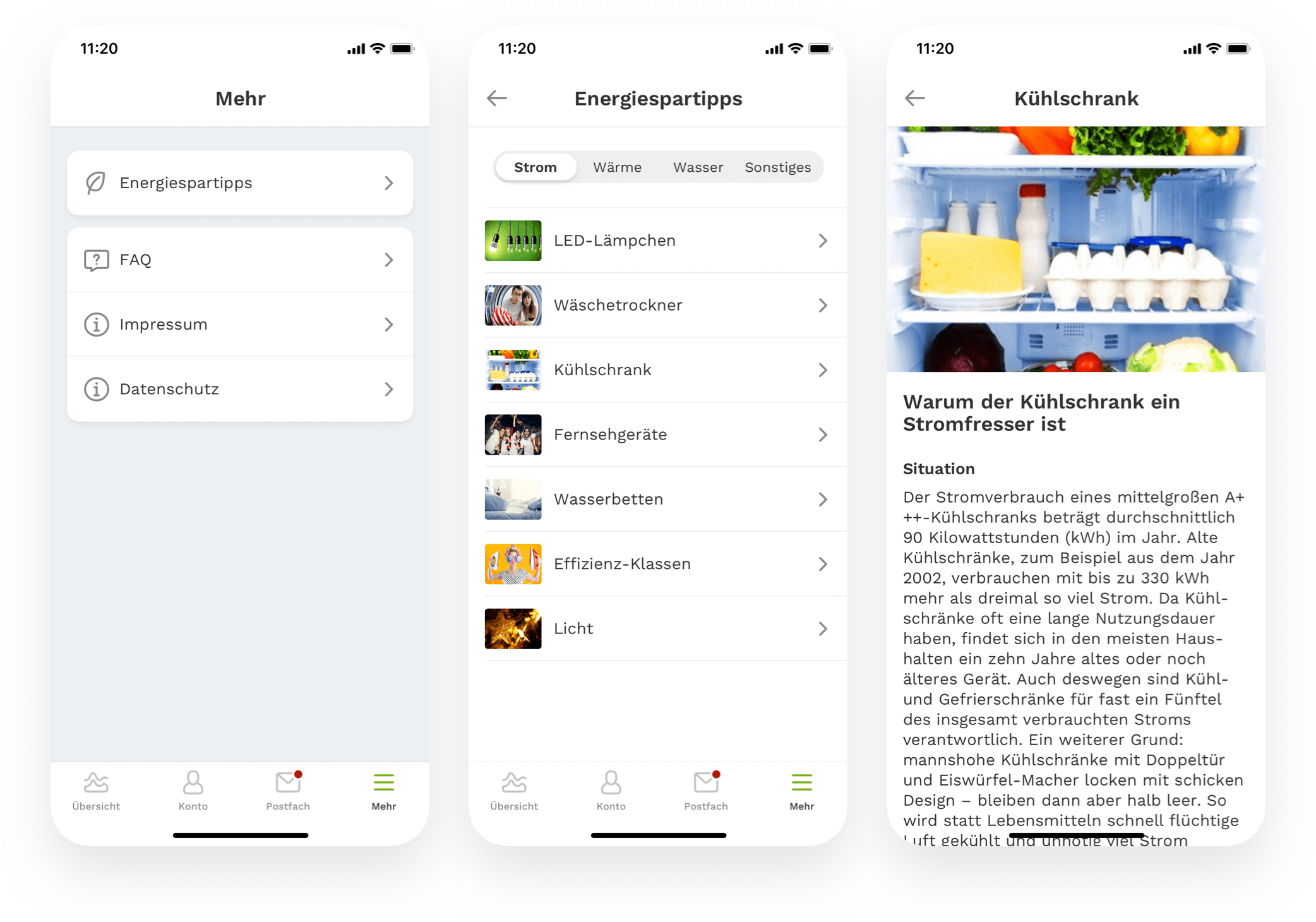
Energy-saving tips are what customers can find in the more tab, alongside legal notice as well as indications referring to copyright and data privacy.
Design Consistency
A design library made out of reusable components is what I build for this project to help myself maintain and update changes to the UI as quickly as possible and as a communication tool for the team. Moreover, it’s a reference guide for consistency in design language for iOS and Android apps. We used custom components only where we needed to, as the graph visualizations, to provide a native well-known platform experience to customers. I also created a unique set of custom icons for a unified look of the user interface. When you build a design that you want to function, you have to go through each component and think out the different use-cases and interaction flows to ensure a coherent user experience. Part of the specification is not only the happy states of the UI but also the error, empty, inactive, and loading states.
The engineers will stay in perfect sync with the latest design specification thanks to the collaboration and prototyping tools Zeplin and Framer.
Learnings
- Get comfortable with critical feedback about your design and use that to your advantage. Focus on serving the users and their needs to make a great product from the start. That should always be your path-direction. Above all, it’s your job to help people to achieve their goals, not yours.
- Talking to stakeholders about design or asking difficult questions is not always easy. Try to ask questions as often as needed to eliminate guesswork and support the stakeholders in understanding your design. It improves the working efficiency and helps with everyone being on the same page.
- Get into intense collaboration with the engineers early on and talk to them regularly. I can’t stress this one thing enough. Design is not static, like nothing in the real world is. It moves, impacts, directs, empowers, and primarily lives. Prototyping on your own is one thing, but working together with the engineers on the real code build product is something different. I designed and prototyped a lot of concepts to learn that some were feasible to do and others not because of development costs or technical reasons. Although almost anything can be built with code, you have to be flexible to adapt your design to an existing framework when it needs to be. Learn from your engineers what is possible and what not. You don’t need to reinvent the wheel, use conventions, and patterns that have been proven to work and are known by millions of smartphone users. It’s sometimes hard for designers, like myself included, because we tend to create entirely new things instead of using what is already there and works. In this project, we reduced custom interactions to a minimum and only used them, where we thought it would be beneficial and add up to the overall UX. The grab and drag button in the dashboard for adding new meter readings and the adjustment of the monthly payment, for example, are custom build interactions patterns.
Sit together with the engineers whenever possible and learn from them to skyrocket your design skills. My special thanks and credits go to the very talented developers Klaus M. Rodewig (iOS) and Emre Subaşı (Android).
The app is available on the Apple App Store and Google Play. I currently support the team at Stadtwerke Düsseldorf on the work of future updates to the app, including the incorporation of new user testing results. Furthermore, we are working on new features that scale the ecosystem to new services which will bring even more power to the customers.
Whether you want to talk about a project or just to say hi — feel free to contact me:
Whether you want to talk about a project or just to say hi — feel free to contact me:
Whether you want to talk about a project or just to say hi — feel free to contact me:
Whether you want to talk about a project or just to say hi — feel free to contact me:
Whether you want to talk about a project or just to say hi — feel free to contact me: